
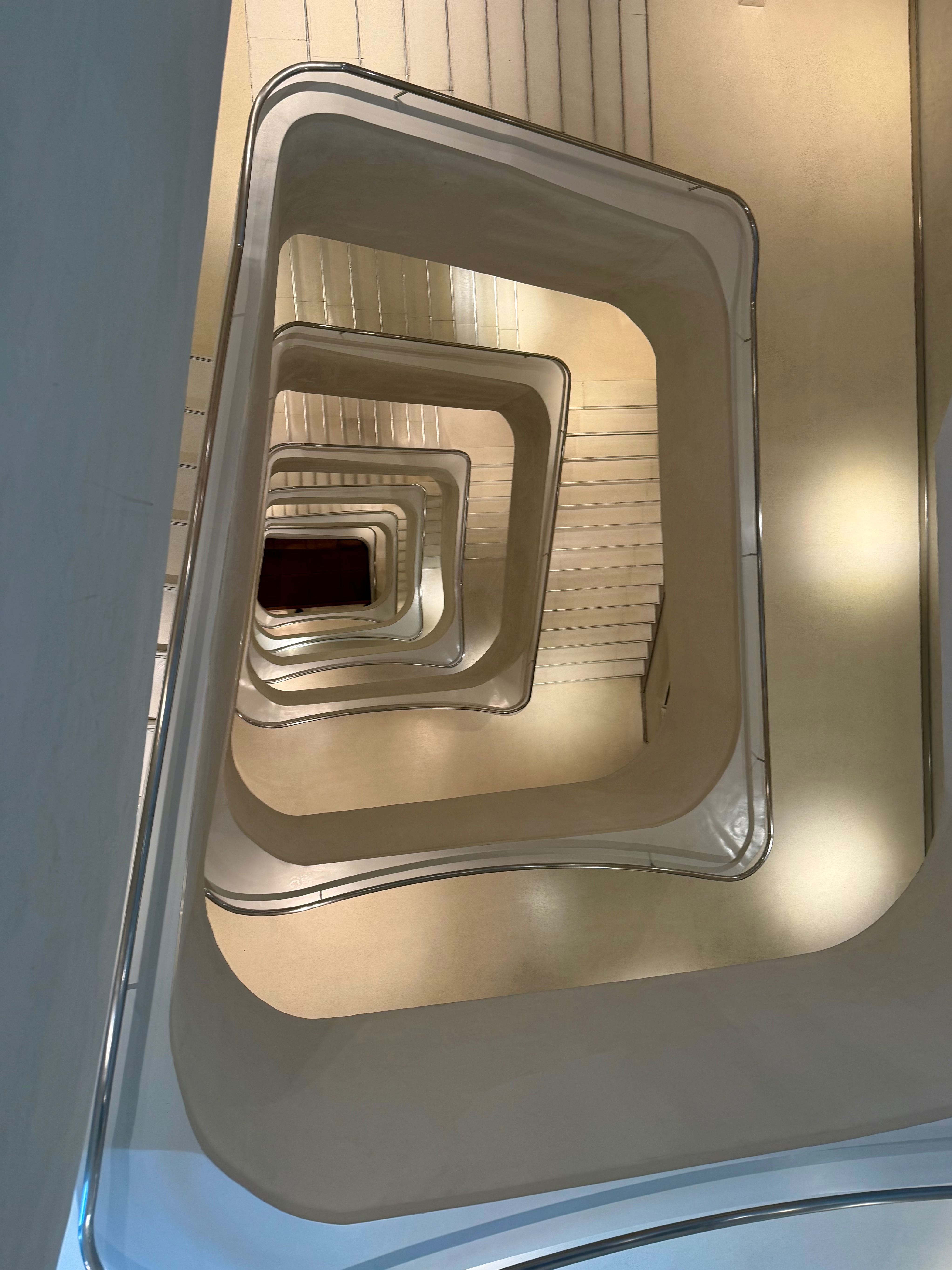
Warm White — Memory, and Human Presence
One of nine colors of Seeing. Warm White: The Colour of Belonging, Memory, and Human Presence
Warm White in the world
Few colours occupy such a broad territory in human experience as blue. It appears simultaneously in nature, culture, art, design, and technology, while carrying remarkably consistent symbolic associations across these different domains. The sky, the sea, distant landscapes, rivers, and countless flowers have made blue one of the most familiar colours in the natural world, while artists, philosophers, and poets have repeatedly turned to it when exploring questions of contemplation, distance, and transcendence.
Research in colour psychology adds another dimension to this understanding. Blue is consistently associated with trust, calmness, reliability, and stability, which helps explain why it has become one of the most frequently used colours in contemporary design. Financial institutions, healthcare organizations, and technology companies rely heavily on blue because it communicates reassurance and predictability.
Yet blue continues to resist simple definition. It remains both the colour of technological trust and the colour of wonder. It suggests both stability and exploration. Perhaps this duality explains its enduring presence across such different contexts. Blue seems uniquely capable of connecting the familiar with the unknown.
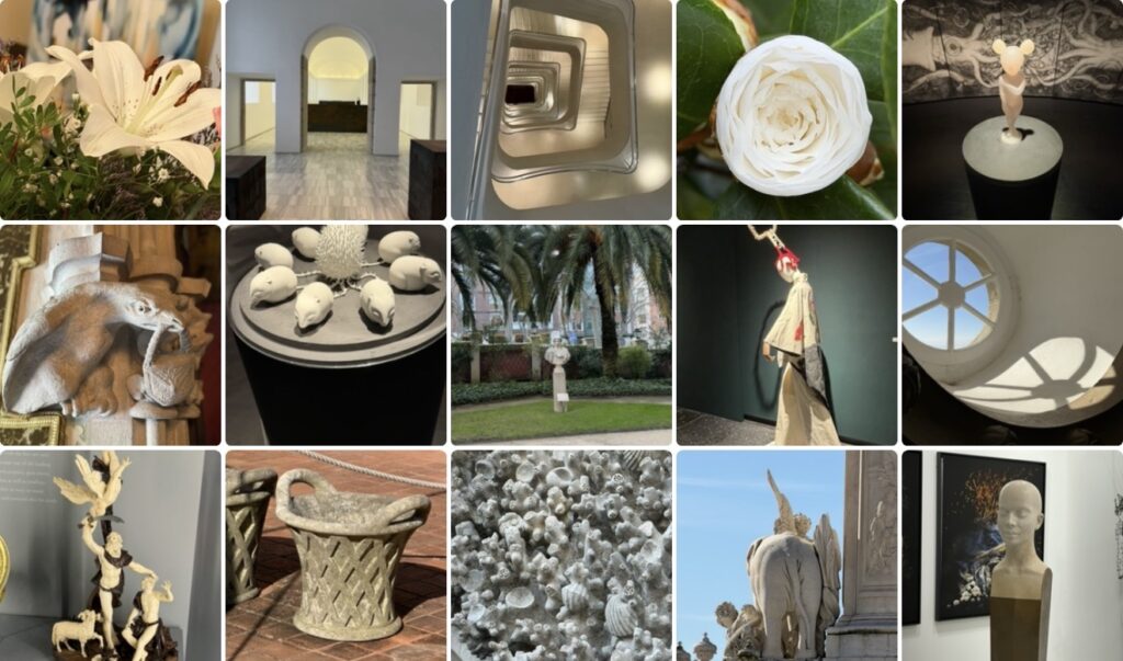
A visual constellation of inhabited spaces
When the photographs are viewed together, the most striking characteristic is not the colour itself but the evidence of human presence. The collection brings together flowers, fountains, architectural details, textiles, sculptures, markets, and carefully composed interiors. Although these subjects appear unrelated at first glance, they gradually reveal a shared visual language.
Many of the images contain objects that have been shaped by human hands. Carved surfaces, crafted materials, cultivated flowers, and decorative elements appear repeatedly throughout the collage. Even the natural forms suggest care and cultivation rather than wilderness. The flowers are not isolated botanical studies but part of gardens and lived environments. The architectural details are not abstract compositions but fragments of places designed to be inhabited.
Another pattern emerges through the repetition of thresholds and gathering places. Windows frame the outside world while simultaneously creating a sense of shelter. Arches suggest movement from one space into another. Courtyards, market scenes, and interior spaces create a rhythm that encourages the eye to move through the collage rather than simply across it.
The photographs also reveal an interesting relationship between permanence and change. Stone, ceramics, and architectural details suggest durability, while flowers remind us of fragility and impermanence. The coexistence of these elements creates a visual conversation between what endures and what continuously changes.
Perhaps this is why the collection feels so familiar. The images are not connected by a particular location or a specific narrative. They are connected through their ability to evoke places that carry memory.
When does a space become a place?
The distinction between space and place has occupied philosophers, architects, and artists for generations. A space can be measured, mapped, and described through its physical characteristics. A place, however, emerges through experience. It acquires meaning through memory, relationships, rituals, and repeated encounters.
Looking at the collage, this distinction becomes increasingly difficult to ignore. The photographs do not simply document objects or architectural forms. They record traces of human presence. A market stall represents more than commerce. A fountain represents more than design. A flower growing beside a pathway represents more than a botanical specimen.
Each image contains evidence of stories that extend beyond the frame.
This may explain why certain places remain so vivid in memory long after specific details have faded. We often remember the atmosphere of a place more clearly than its dimensions. We remember the quality of the light, the texture of a wall, the feeling of entering a courtyard, or the scent of flowers carried through an open window.
Memory itself rarely develops in a linear way. It moves through associations, linking objects, colours, materials, and experiences into a network of relationships. Warm white seems particularly well suited to preserving these connections because it allows individual elements to coexist without competing for attention.
The photographs suggest that belonging develops in much the same way. It cannot be designed into existence through architecture alone, nor can it be reduced to geography. Belonging emerges gradually through familiarity, participation, and care.
The search for human places
This question feels especially relevant in a period characterized by rapid technological transformation. Contemporary life is increasingly mediated through digital systems that prioritize efficiency, accessibility, and speed. These developments have brought extraordinary opportunities, but they have also altered the relationship between people and the physical environments they inhabit.
Against this background, the renewed interest in craftsmanship, local materials, historical spaces, and human-scale environments seems less surprising. These places provide something that cannot easily be replicated through technology alone. They engage the senses in different ways and create opportunities for connection that extend beyond functionality.
The photographs within the collection seem to respond to this longing. They remind us that beauty is often inseparable from evidence of human care. The worn surface of a stone wall, the irregularity of handcrafted ceramics, the arrangement of flowers within a garden, and the presence of objects shaped through time all contribute to an atmosphere that feels unmistakably alive.
Perhaps this is the enduring lesson of warm white. It suggests that simplicity does not require sterility and that clarity does not require emotional distance. The most memorable places are often those that preserve a sense of warmth, imperfection, and human presence.
An invitation
The photographs invite an exercise in observation. Which image attracts attention first? Is it the flower, the doorway, the sea, the window, or the sky?
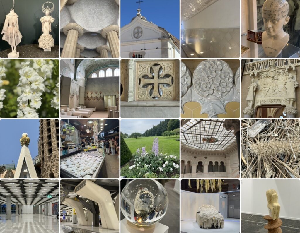
The collection offers no single definition of belonging, nor does it attempt to explain why certain places remain with us while others disappear from memory. Instead, it invites a slower form of observation, encouraging viewers to consider which image feels most familiar and why.
The answer will almost certainly differ from one person to another, yet the question remains remarkably consistent:
What transforms a space into a place that feels like home?
Perhaps the answer lies not in architecture, objects, or even memory itself, but in the countless acts of care that gradually turn physical spaces into places of meaning. Warm white simply makes those traces visible.
About The Colour of Seeing
This essay is part of The Colour of Seeing, a series of photographic reflections exploring how colours shape perception, memory, emotions, and meaning. All photographs taken by Novisali.
Readers interested in the broader ideas behind the series are invited to begin with the introductory Story, which explores insights from colour psychology, design, philosophy, art, and contemporary research into how colours influence the way we experience the world.

Novisali crafts visual conversations that challenge perception and invite deeper reflection on the world we live in.