
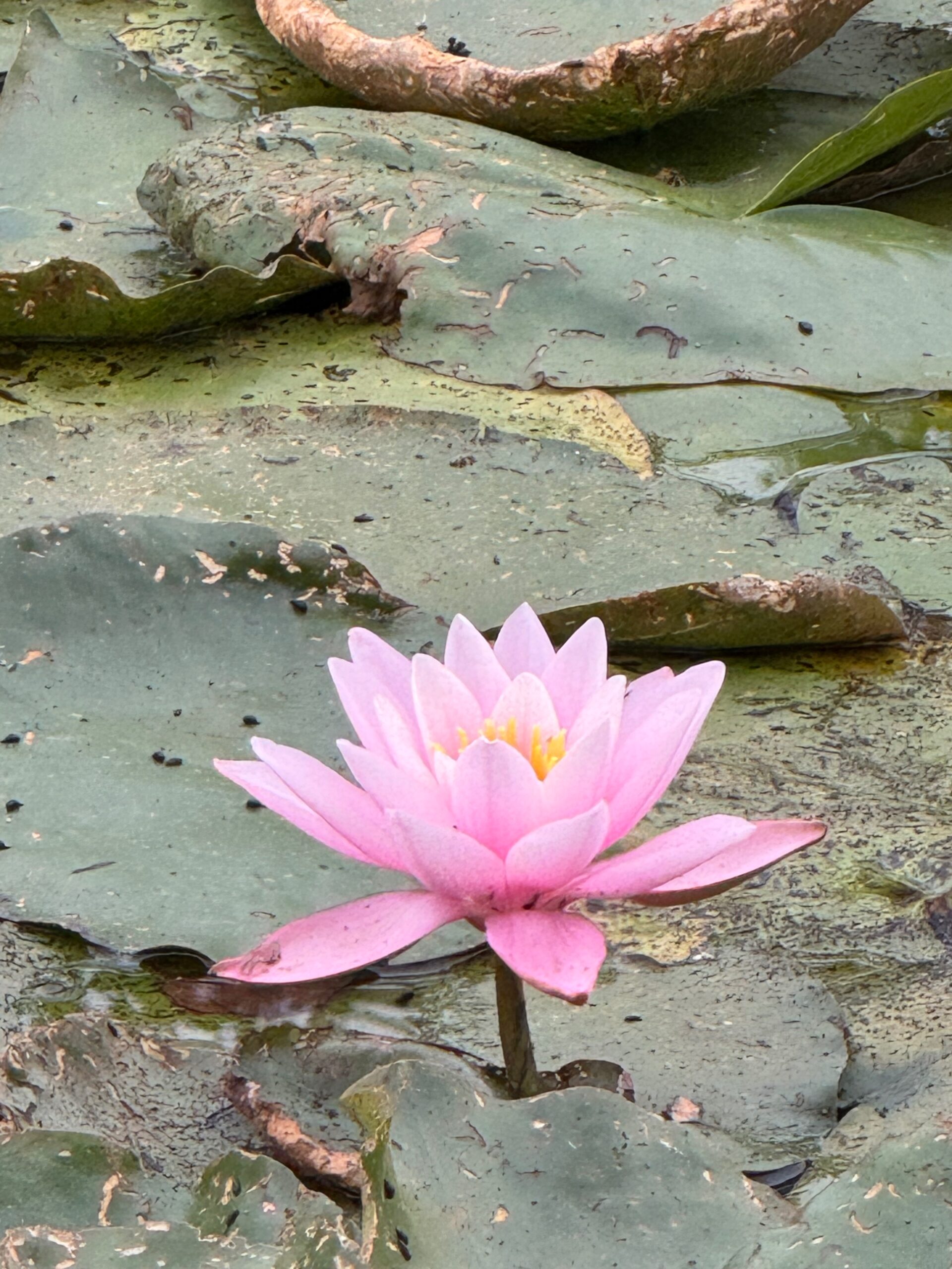
Pink — Care and Connection
One of nine colors of Seeing. Pink Makes Tenderness Visible: Care, Connection, and the Quiet Strength of Softness
Care in the world
Few colours occupy such a broad territory in human experience as blue. It appears simultaneously in nature, culture, art, design, and technology, while carrying remarkably consistent symbolic associations across these different domains. The sky, the sea, distant landscapes, rivers, and countless flowers have made blue one of the most familiar colours in the natural world, while artists, philosophers, and poets have repeatedly turned to it when exploring questions of contemplation, distance, and transcendence.
Research in colour psychology adds another dimension to this understanding. Blue is consistently associated with trust, calmness, reliability, and stability, which helps explain why it has become one of the most frequently used colours in contemporary design. Financial institutions, healthcare organizations, and technology companies rely heavily on blue because it communicates reassurance and predictability.
Yet blue continues to resist simple definition. It remains both the colour of technological trust and the colour of wonder. It suggests both stability and exploration. Perhaps this duality explains its enduring presence across such different contexts. Blue seems uniquely capable of connecting the familiar with the unknown.
A visual constellation of relationships
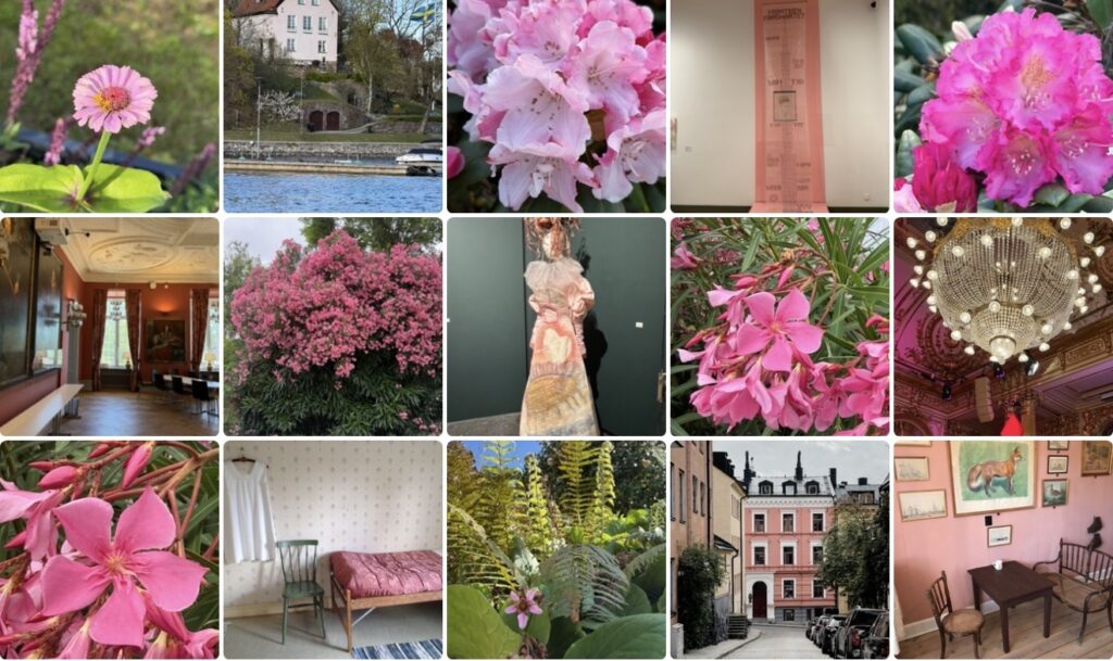
When the photographs are viewed together, the collection reveals a visual language built around closeness. Flowers naturally occupy a central position, yet they do not dominate the composition in the same way they might in a botanical study. Instead, they become part of a broader dialogue that includes textures, forms, cultivated spaces, and objects shaped by human presence.
What is particularly striking is the repetition of layered structures. Petals overlap, branches intertwine, and individual forms repeatedly gather into larger compositions. Very few of the images emphasize isolation. Instead, they create a sense of relationship, suggesting that meaning often emerges through connection rather than through individuality.
Another characteristic that gradually becomes apparent is the absence of visual conflict. The collection does not depend upon dramatic contrasts or strong interruptions. The photographs rely on subtle transitions between tones, allowing one image to flow naturally into the next. The experience of moving through the collage feels almost conversational, as though each photograph were quietly responding to the others.
This visual rhythm encourages a slower form of observation. The eye moves gently through the collection, discovering recurring patterns that might initially go unnoticed. The photographs invite attention without demanding it, and in doing so they reveal one of the defining characteristics of pink itself. Its influence is rarely immediate or forceful. It unfolds gradually.
The strength of tenderness
The collection raises an interesting philosophical question because it challenges one of the most persistent assumptions in contemporary culture: the idea that strength and tenderness occupy opposite ends of the same spectrum.
Many societies continue to celebrate qualities such as speed, efficiency, competition, independence, and individual achievement. These values have undoubtedly contributed to extraordinary advances in science, technology, and economic development. Yet they represent only one dimension of human capability.
The photographs suggest another perspective. Gardens flourish because they are cultivated and cared for. Flowers thrive within relationships between soil, water, light, and countless interconnected living systems. Beauty itself often emerges through processes that require patience, attention, and nurturing.
Perhaps tenderness should not be understood as fragility. Perhaps it should be understood as a form of attentiveness.
This interpretation changes the meaning of the collection. The flowers cease to function as symbols of delicacy and instead become reminders of interdependence. They illustrate a principle that extends far beyond the natural world. Families, communities, organizations, and societies all depend upon relationships built through trust, empathy, and care.
The relevance of this observation extends into many contemporary conversations. Technological progress continues to transform the way people work and communicate, while digital environments increasingly mediate human relationships. At the same time, concerns about isolation, loneliness, and social fragmentation have become more visible.
Perhaps this explains why colours associated with warmth and connection continue to resonate so strongly. They remind us that human flourishing depends upon much more than productivity or efficiency. It also depends upon belonging.
An invitation
The photographs in the collection offer no single definition of tenderness. Some viewers may be drawn toward a particular flower, while others may respond to a specific pattern, texture, or arrangement. The attraction will inevitably be personal because tenderness itself is deeply connected to individual experience.
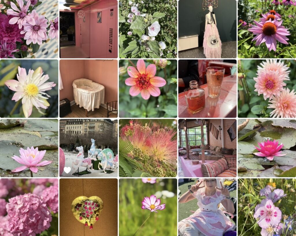
Yet one question continues to emerge while moving through the images.
Can softness itself be a form of strength?
The answer may depend upon how strength is defined. If strength is measured exclusively through power, control, or independence, the question may seem difficult to answer. If strength is understood as the capacity to nurture relationships, sustain communities, and remain open to others, then the photographs suggest a different conclusion.
Perhaps tenderness has never been the opposite of strength.
Perhaps it has always been one of its most enduring expressions.
About The Colour of Seeing
This essay is part of The Colour of Seeing, a series of photographic reflections exploring how colours shape perception, memory, emotions, and meaning. All photographs taken by Novisali.
Readers interested in the broader ideas behind the series are invited to begin with the introductory Story, which explores insights from colour psychology, design, philosophy, art, and contemporary research into how colours influence the way we experience the world.

Novisali crafts visual conversations that challenge perception and invite deeper reflection on the world we live in.