
White — Architecture of Stillness
One of nine colors of Seeing. White: The Architecture of Stillness
White in the world
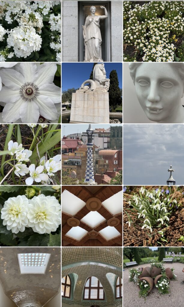
White occupies a unique position among colours because it often appears to withdraw rather than advance. Unlike red, which immediately attracts attention, or yellow, which illuminates, white creates space. It softens visual noise, establishes rhythm, and allows form to emerge with greater clarity. Perhaps this explains why white has played such an important role in architecture, sculpture, photography, and design across cultures and historical periods.
Its symbolic meanings are remarkably diverse. White has been associated with purity, simplicity, wisdom, spirituality, and renewal, but these interpretations tell only part of the story. White also functions as a material. Marble, plaster, limestone, paper, porcelain, and countless natural surfaces demonstrate that white is never truly neutral. It changes with the light, revealing textures and shadows that might otherwise remain unnoticed.
Artists have long understood this relationship. A sculptor working with marble is not simply shaping a form but also shaping the way light will interact with that form. Architects use white to emphasize proportions, guide movement, and create a dialogue between surfaces and space. Photographers often discover that white reveals far more variation than initially expected, because it responds so sensitively to changes in light and perspective.
Perhaps this is why white has become so closely associated with reflection. It creates the conditions that allow observation to deepen.
A visual constellation of light, form, and space
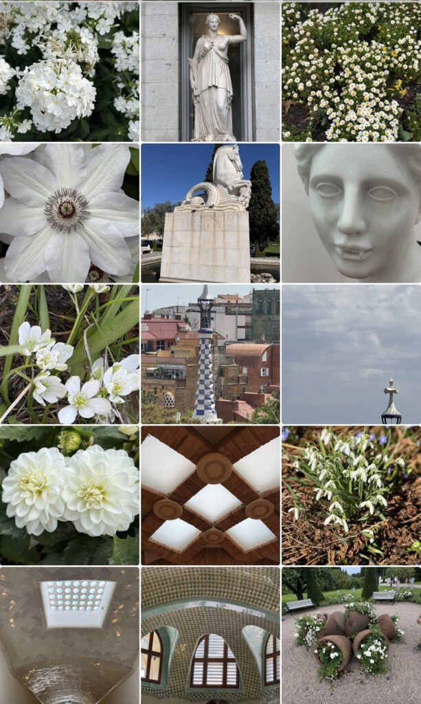
Looking at the collection, the first impression is one of stillness. Yet the longer the photographs are observed, the more apparent it becomes that they are connected through structure rather than through subject matter. Flowers, sculptures, architectural details, windows, statues, and decorative elements all participate in the same visual language.
Geometry appears repeatedly throughout the collage. Circular forms echo one another across different images, while arches and openings establish a rhythm that guides the eye through the collection. Lines create pathways that connect one photograph to another, allowing the individual images to function less as separate compositions and more as parts of a larger whole.
Light plays an equally important role. White rarely dominates the photographs through colour alone. Instead, it defines surfaces and reveals relationships between objects and their surroundings. Shadows become as important as illuminated areas, creating subtle contrasts that give depth to the images. The collection therefore depends less on colour than on the interaction between light and form.
Another pattern gradually emerges through the repeated appearance of thresholds. Windows frame landscapes beyond their boundaries, architectural openings suggest movement between spaces, and pathways invite exploration without revealing their destination. Even the flowers seem to participate in this visual language, unfolding through layered structures that simultaneously conceal and reveal.
The photographs encourage a slower form of observation because they resist immediate interpretation. At first glance, the images appear simple. Over time, however, the repetition of shapes, textures, and transitions begins to create unexpected connections.
Perhaps this explains why the collection feels so contemplative. The images create a space in which attention naturally slows.
Emptiness and the possibility of seeing differently
White is often described as the absence of colour, yet the photographs suggest a very different interpretation. Nothing in the collection feels empty. Instead, the images demonstrate how space itself can become an active element within a composition.
This observation raises an interesting question about emptiness. In many artistic and philosophical traditions, empty space is not understood as a void but as a field of possibility. In music, silence gives structure to sound. In architecture, open space allows movement and orientation. In visual art, areas left untouched frequently become as important as the marks themselves.
The collection repeatedly returns to this relationship between presence and absence. Architectural spaces depend upon what has been left open. Sculptures derive much of their expressive power from the spaces surrounding them. Flowers reveal their structure through the arrangement of petals and the intervals between them.
Perhaps this is why white has often been associated with contemplation and spiritual reflection. It creates enough distance from distraction to allow another way of seeing to emerge.
The question becomes particularly relevant in a world increasingly characterized by acceleration. Contemporary life often rewards speed, productivity, and constant stimulation, leaving little room for stillness or reflection. Yet the photographs suggest that understanding may require a different rhythm. Certain experiences only become visible when observation slows.
The collection does not propose retreat as an alternative to activity. Instead, it suggests that stillness itself can become a form of engagement. White creates a visual environment in which complexity remains present but no longer demands immediate interpretation.
An invitation
The photographs invite viewers to identify the image that first captures their attention. Some may be drawn toward architecture, while others may focus on sculpture, flowers, or particular patterns of light. The response is likely to be personal because the collection does not impose a single narrative.
What connects the images is not their subject matter but their invitation to pause.
Perhaps this is the enduring lesson of white. It reminds us that space is never simply empty and that stillness should not be confused with inactivity. Both create opportunities for discovery that might otherwise remain hidden.
The collection therefore leaves an open question:
Is emptiness the absence of something, or is it the space in which something new can appear?
Perhaps the answer depends less on what is being observed and more on the willingness to remain with it long enough for new possibilities to become visible.
About The Colour of Seeing
This essay is part of The Colour of Seeing, a series of photographic reflections exploring how colours shape perception, memory, emotions, and meaning. All photographs taken by Novisali.
Readers interested in the broader ideas behind the series are invited to begin with the introductory Story, which explores insights from colour psychology, design, philosophy, art, and contemporary research into how colours influence the way we experience the world.

Novisali crafts visual conversations that challenge perception and invite deeper reflection on the world we live in.