
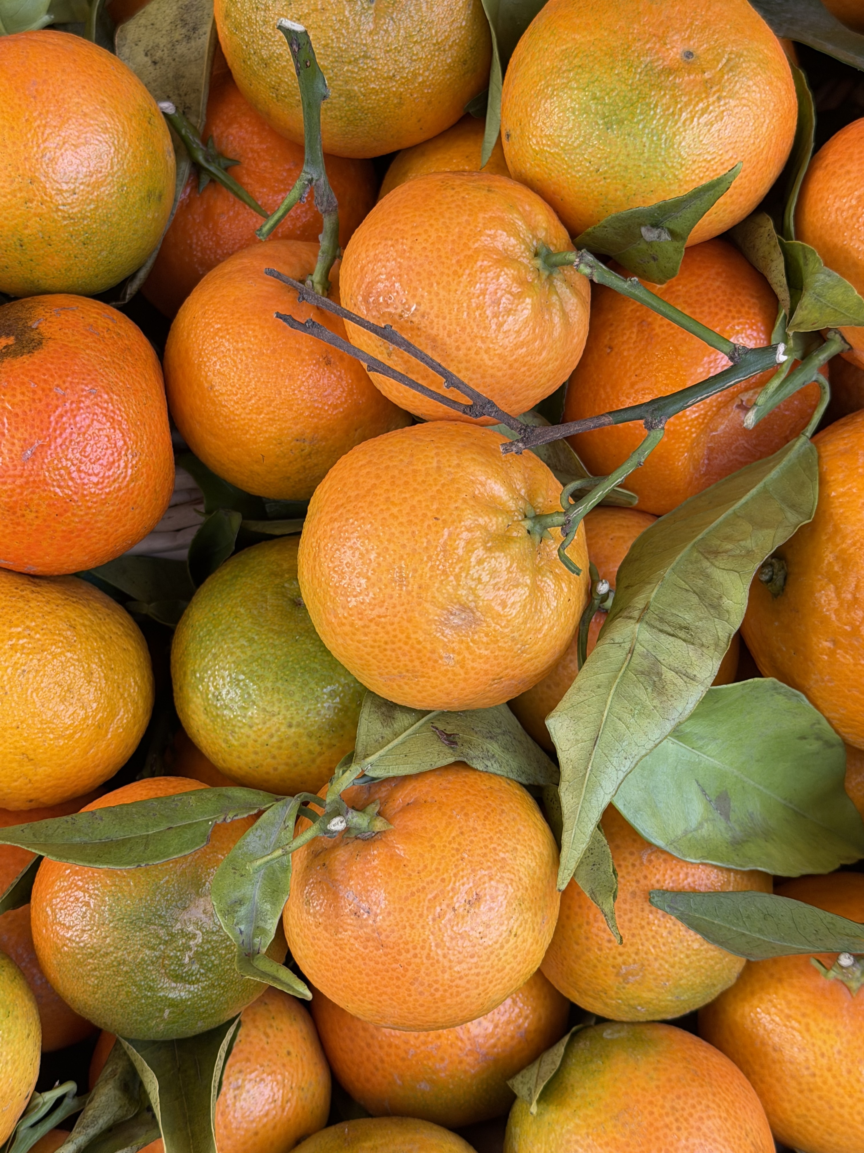
Orange — Warmth and Community
One of nine colors of Seeing. Orange Holds the Warmth: Creativity, Hospitality, and the Places That Gather Us
Orange in the world
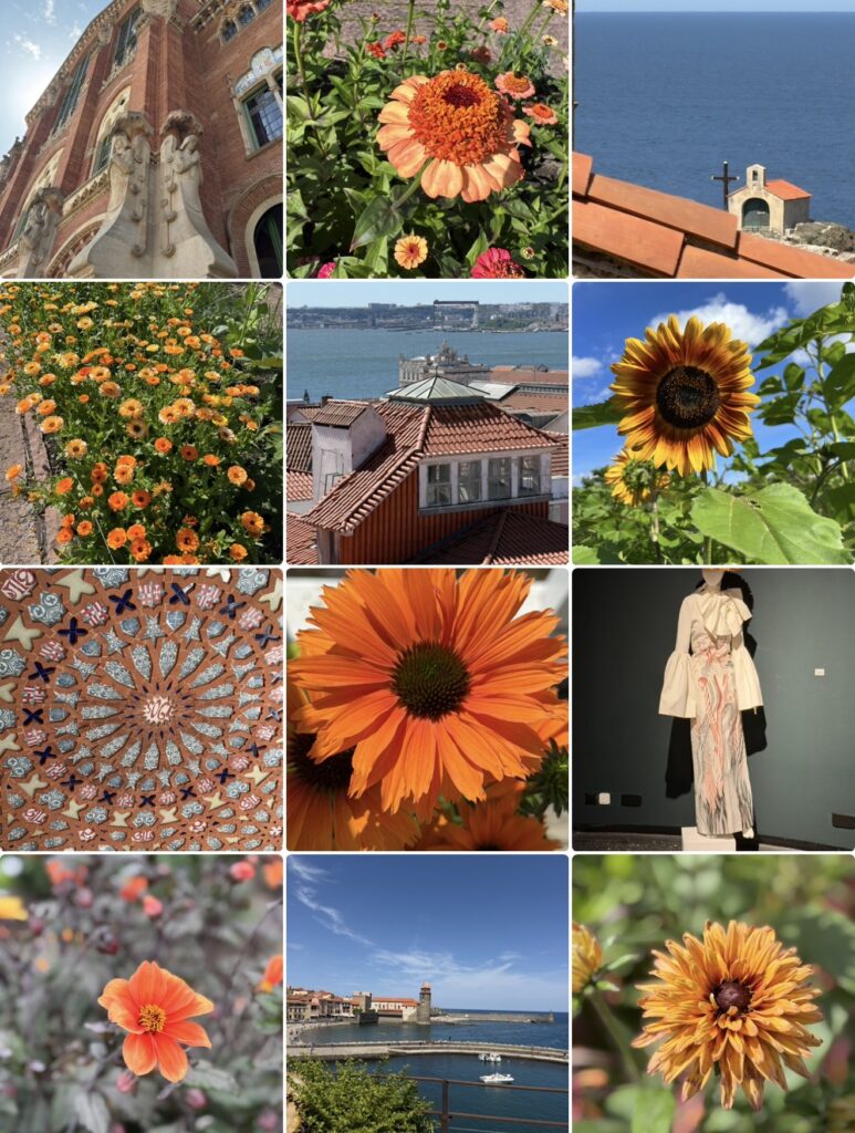
Orange occupies an intriguing position in the spectrum of colours because it brings together two very different energies. It combines the brightness of yellow with the intensity of red, creating a colour that feels both vibrant and welcoming. Throughout history, orange has appeared in autumn landscapes, terracotta, spices, clay, fire, sunsets, fruit, and countless expressions of human craftsmanship. It belongs equally to nature and to culture, which may explain why it carries such a rich and diverse symbolic language.
In design, orange is frequently associated with creativity, enthusiasm, sociability, and communication. It introduces warmth into a space without becoming as visually dominant as red, while retaining an energy that softer colours often lack. Architects and designers have long recognized the ability of earth tones and warm colours to create environments that feel inviting rather than formal.
Yet orange seems to resist purely functional interpretations. It rarely exists as a neutral background. Instead, it establishes an atmosphere. It changes the emotional character of a place and influences how spaces are experienced. Unlike colours that encourage contemplation or distance, orange often creates a feeling of participation. It invites people inward.
Perhaps this is why orange appears so naturally in places where people gather.
A visual constellation of shared spaces
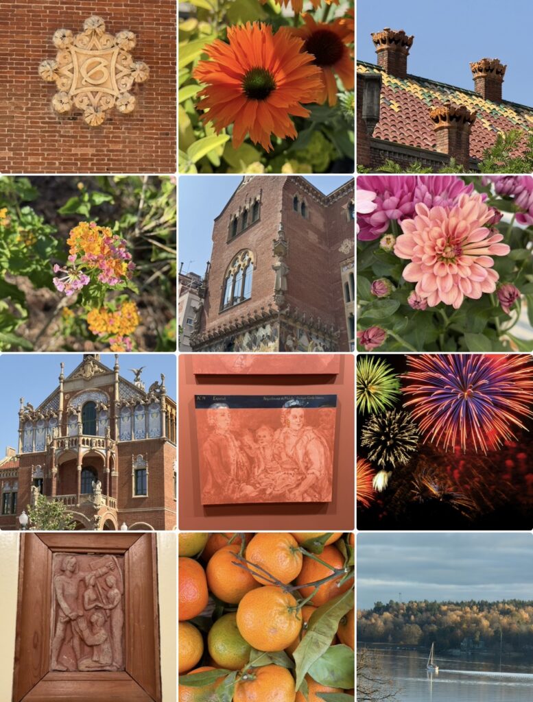
When the photographs are viewed together, a fascinating pattern begins to emerge. Flowers and natural landscapes certainly play an important role within the collection, but they share the visual field with architecture, courtyards, rooftops, stone walls, artistic details, and spaces shaped through human activity.
What connects the images is not simply colour but a recurring sense of place. The photographs repeatedly return to environments that feel inhabited. Buildings are rarely presented as isolated structures. Instead, they appear as extensions of communities and landscapes, creating a dialogue between human creativity and the natural world.
The collection also reveals a remarkable consistency in its materials. Stone, brick, clay, terracotta, and weathered surfaces appear throughout the images, creating a visual continuity that extends across architecture, sculpture, and landscape. These materials have accompanied human settlements for centuries, carrying traces of both history and craftsmanship.
Perhaps the most striking characteristic of the collage is its relationship with light. Orange never appears static. It shifts continuously as sunlight moves across surfaces, transforming textures and altering the atmosphere of each scene. A wall illuminated in the early morning creates a different emotional response than the same wall at sunset. The photographs repeatedly demonstrate that warmth is not a fixed property but an experience shaped by context.
Looking across the collection, it becomes increasingly difficult to separate the colour from the environments in which it appears. Orange seems less interested in individual objects than in the relationships connecting them.
The meaning of warmth
The photographs raise a question that extends far beyond colour itself. Is warmth something that exists within a place, or is it something created through human relationships?
The distinction may appear subtle, yet it changes the way many environments are understood. Some spaces immediately create a sense of welcome, while others remain distant despite their beauty. The difference often has very little to do with architecture alone.
A marketplace becomes memorable because of the interactions that take place within it. A courtyard acquires meaning through conversation and shared experiences. A home becomes significant not because of its physical structure but because of the relationships it shelters.
The collection repeatedly returns to this idea. Warmth appears not as a physical condition but as a form of exchange. It emerges through hospitality, creativity, craftsmanship, and community.
This observation feels particularly relevant in a world increasingly shaped by digital communication. Technology has expanded opportunities for connection while simultaneously transforming the spaces in which those connections occur. Virtual environments have become essential to contemporary life, yet they often struggle to reproduce the sensory qualities that make physical places memorable.
Perhaps this explains why environments characterized by texture, craftsmanship, and materiality continue to exert such a powerful attraction. They remind us that human beings experience places not only through sight but also through memory, touch, and emotion.
The orange collection suggests that warmth cannot be reduced to temperature or colour alone. It emerges through relationships between people, places, and the stories that unfold between them.
An invitation
The photographs encourage a slower form of looking because they resist any single interpretation. One viewer may be drawn toward the architectural details, while another may focus on a flower, a landscape, or the changing qualities of light. The images create different pathways through the collection, yet they continue to return to the same underlying theme.
Is warmth something we receive from the world, or is it something we create through the way we inhabit it?
Perhaps this is why orange continues to feel so familiar. It reminds us that places become meaningful through participation rather than observation alone. The colour invites us not simply to admire the world around us but to become active contributors to the environments we value and the communities we choose to build.
About The Colour of Seeing
This essay is part of The Colour of Seeing, a series of photographic reflections exploring how colours shape perception, memory, emotions, and meaning. All photographs taken by Novisali.
Readers interested in the broader ideas behind the series are invited to begin with the introductory Story, which explores insights from colour psychology, design, philosophy, art, and contemporary research into how colours influence the way we experience the world.

Novisali crafts visual conversations that challenge perception and invite deeper reflection on the world we live in.