
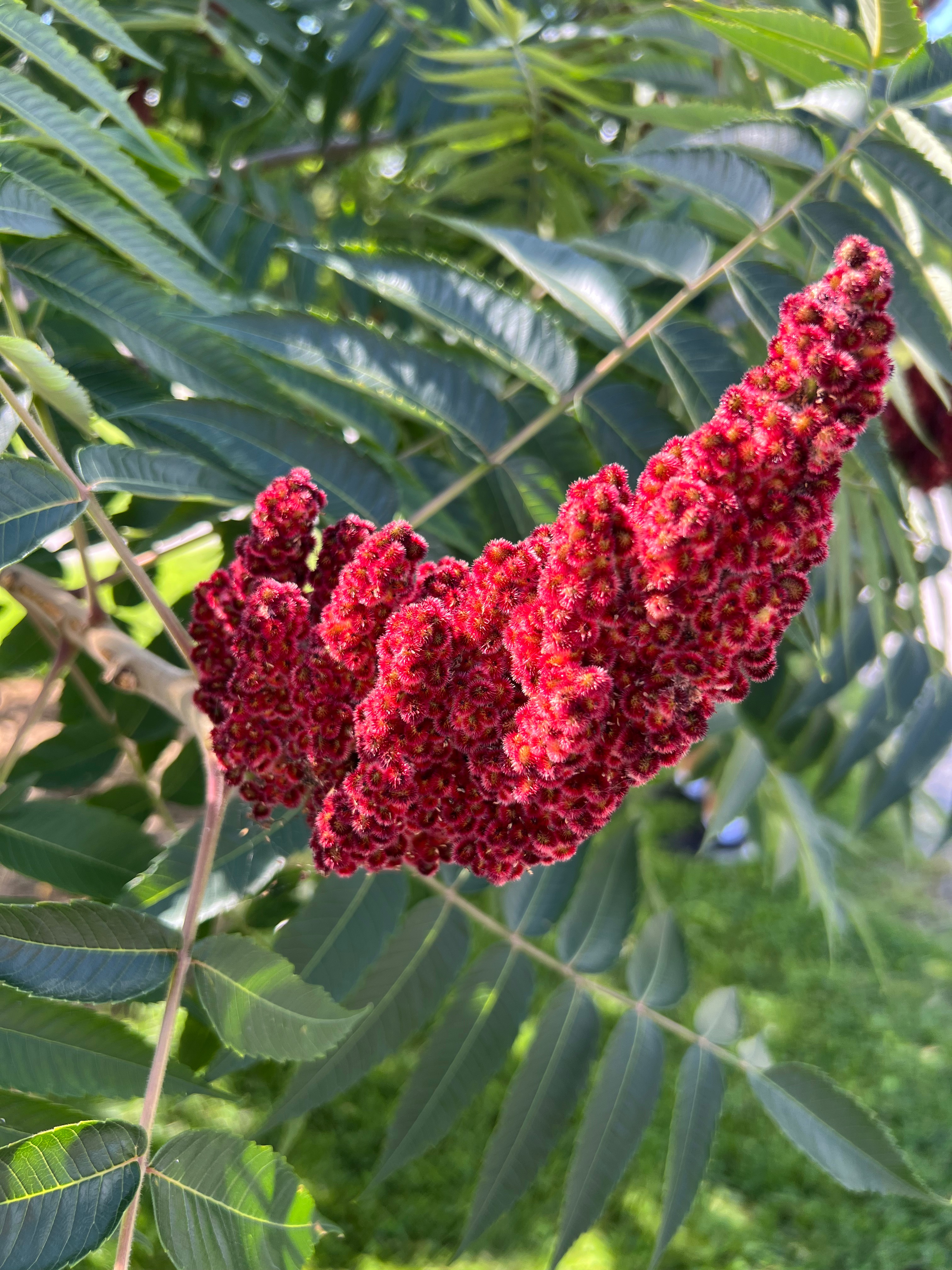
Red — Passion, Presence, and the Courage to Be Visible
One of nine colors of Seeing. Red Refuses to Be Ignored: Passion, Presence, and the Courage to Be Visible
Red in the world
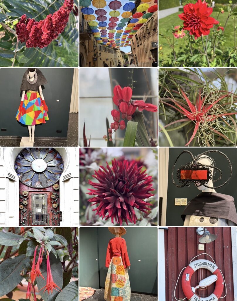
Few colours have shaped human culture as profoundly as red. It is the colour of fire and blood, of ripened fruit and autumn leaves, of warning signals and celebrations. Across civilizations, red has been associated with life, power, passion, love, sacrifice, courage, prosperity, and transformation. Although these meanings vary across cultures, they all reflect a common characteristic: red demands attention.
Research in colour psychology suggests that red can influence both emotional and physiological responses. It has been associated with heightened alertness, increased energy, and stronger emotional reactions than many other colours. Designers understand its power and use it deliberately when they want to create emphasis, direct attention, or communicate urgency. Unlike colours that quietly blend into their surroundings, red establishes a clear visual presence.
Yet the enduring significance of red cannot be explained through biology alone. The colour carries an emotional and symbolic weight that extends far beyond perception. It appears repeatedly in rituals, artistic traditions, religious imagery, political movements, and cultural celebrations because it speaks to experiences that are deeply connected to human existence. Red marks important moments. It announces beginnings and endings, celebrations and warnings, desire and resistance.
Perhaps this is why red continues to feel so immediate. It reminds us that some experiences refuse to remain in the background.
A visual constellation of intensity and expression
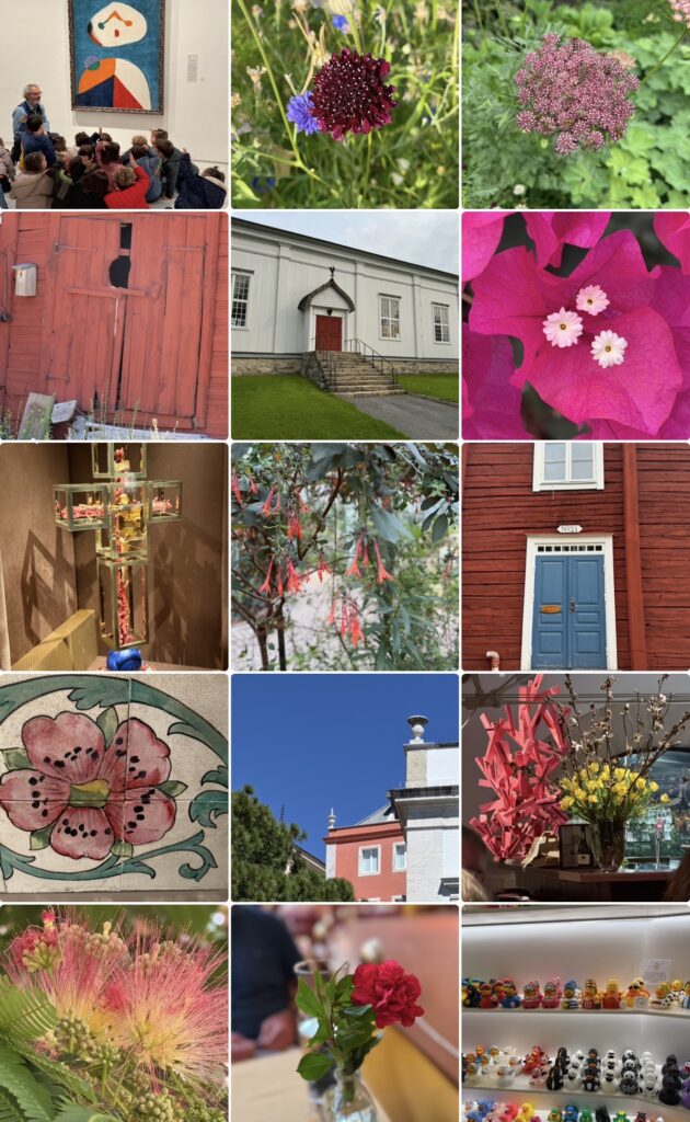
When the photographs are viewed together, the collection reveals much more than a series of red objects. Flowers naturally attract attention, yet they are accompanied by architecture, textiles, decorative details, cultivated landscapes, and surfaces transformed by light. The images create a visual conversation in which red repeatedly emerges as a force that shapes the entire composition.
What becomes particularly interesting is the diversity of expression contained within the same colour. Some photographs communicate energy and movement, while others suggest stillness and concentration. Certain images reveal dramatic contrasts, while others depend upon subtle variations in texture and tone. The collection demonstrates that intensity does not always require excess. Red can be both expansive and restrained.
Another pattern gradually emerges through the repetition of organic forms. Petals unfold in layered structures, architectural details echo the same visual rhythms, and natural elements establish relationships with human-made environments. The boundaries between nature and culture become less distinct, suggesting that the meaning of the colour is not contained within individual objects but within the connections that develop between them.
The collage also reveals how powerfully colour can influence perception. Red rarely allows the eye to wander aimlessly. Attention is repeatedly redirected toward particular forms and details, creating a rhythm that guides the experience of moving through the images. Yet the collection avoids becoming overwhelming because each photograph introduces a different expression of the colour, allowing intensity to coexist with nuance.
Rather than presenting red as a symbol with a fixed meaning, the collection reveals its remarkable ability to adapt to different contexts while retaining its unmistakable presence.
Visibility and the human desire to be seen
The photographs raise a question that reaches beyond colour and into the heart of human experience. What does it mean to become visible?
Visibility is often discussed as though it were simply a matter of being noticed, yet the two concepts are not identical. To attract attention is not necessarily to be understood. In many ways, visibility involves a much deeper process. It requires recognition, presence, and the willingness to reveal something authentic.
This distinction becomes particularly relevant when considering the symbolic role of red. Throughout history, the colour has marked moments in which human beings step forward, express themselves, celebrate, protest, create, or declare their presence. Red does not hide. It occupies space.
At the same time, visibility requires courage. To be seen is to accept vulnerability. Artists understand this well. Every work that enters the public sphere represents an act of exposure. It reveals not only an object but also a perspective, a choice, and a way of interpreting the world.
The photographs in the collection suggest that visibility should not be understood as performance alone. The flowers do not bloom in order to attract attention, nor do landscapes seek recognition. Their presence is simply an expression of their nature.
Perhaps there is an important lesson in this observation. Authenticity does not require exaggeration. Presence does not require spectacle. The most compelling forms of visibility often emerge through a quiet confidence that allows things to reveal themselves naturally.
Seen from this perspective, red becomes less a colour of urgency and more a colour of presence.
An invitation
The collection invites viewers to consider which image captures their attention and, perhaps more importantly, why. The answer will inevitably differ from one person to another, because attention is shaped by memory, experience, and personal associations.
Yet beneath these individual responses lies a larger question.
What do we choose to make visible in our own lives, and what remains hidden?
The photographs offer no simple answer, nor do they attempt to define the meaning of the colour. Instead, they suggest that visibility is not merely about attracting attention. It is about allowing ourselves, our stories, and our experiences to occupy space with honesty and intention.
Perhaps this is why red continues to fascinate. It reminds us that life is not lived entirely in the background. Some moments ask to be noticed, some experiences insist on being expressed, and some colours refuse to be ignored.
About The Colour of Seeing
This essay is part of The Colour of Seeing, a series of photographic reflections exploring how colours shape perception, memory, emotions, and meaning. All photographs taken by Novisali.
Readers interested in the broader ideas behind the series are invited to begin with the introductory Story, which explores insights from colour psychology, design, philosophy, art, and contemporary research into how colours influence the way we experience the world.

Novisali crafts visual conversations that challenge perception and invite deeper reflection on the world we live in.