
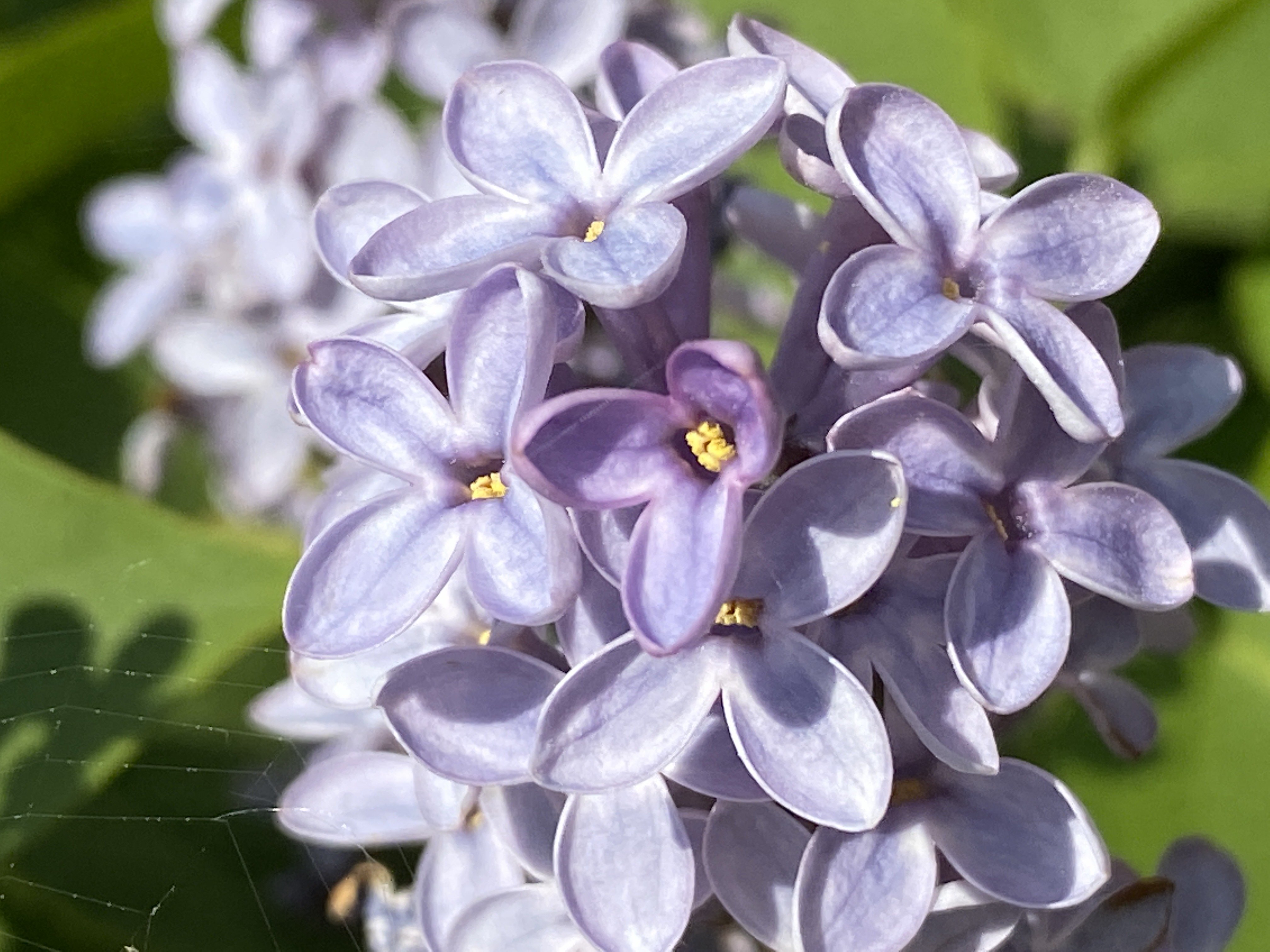
Violet — In Between
One of nine colors of Seeing. Violet Lives Between: Ambiguity, Transformation, and the Spaces That Refuse Definition
Violet in the world
Among all colours, violet may be the most difficult to define. Situated between blue and red, it combines qualities that often appear contradictory. Blue is traditionally associated with contemplation, distance, and trust, while red evokes intensity, passion, and vitality. Violet occupies the space between them, creating a colour that resists simple interpretation.
Perhaps this explains why violet has accumulated such a rich symbolic history. Throughout different periods and cultures, it has been associated with spirituality, creativity, mystery, wisdom, introspection, and transformation. In art, violet often appears in moments of transition, when light changes and boundaries become less distinct. In nature, it emerges in flowers that seem almost unreal in their intensity, while in the sky it appears during the brief moments when day gives way to evening and familiar landscapes are transformed by changing light.
Unlike colours that communicate a more immediate message, violet often introduces uncertainty. It does not demand a particular interpretation. Instead, it invites reflection. This characteristic makes it especially relevant in a world increasingly defined by complexity and change, where traditional categories and established boundaries are becoming less stable than they once appeared.
A visual constellation of transitions
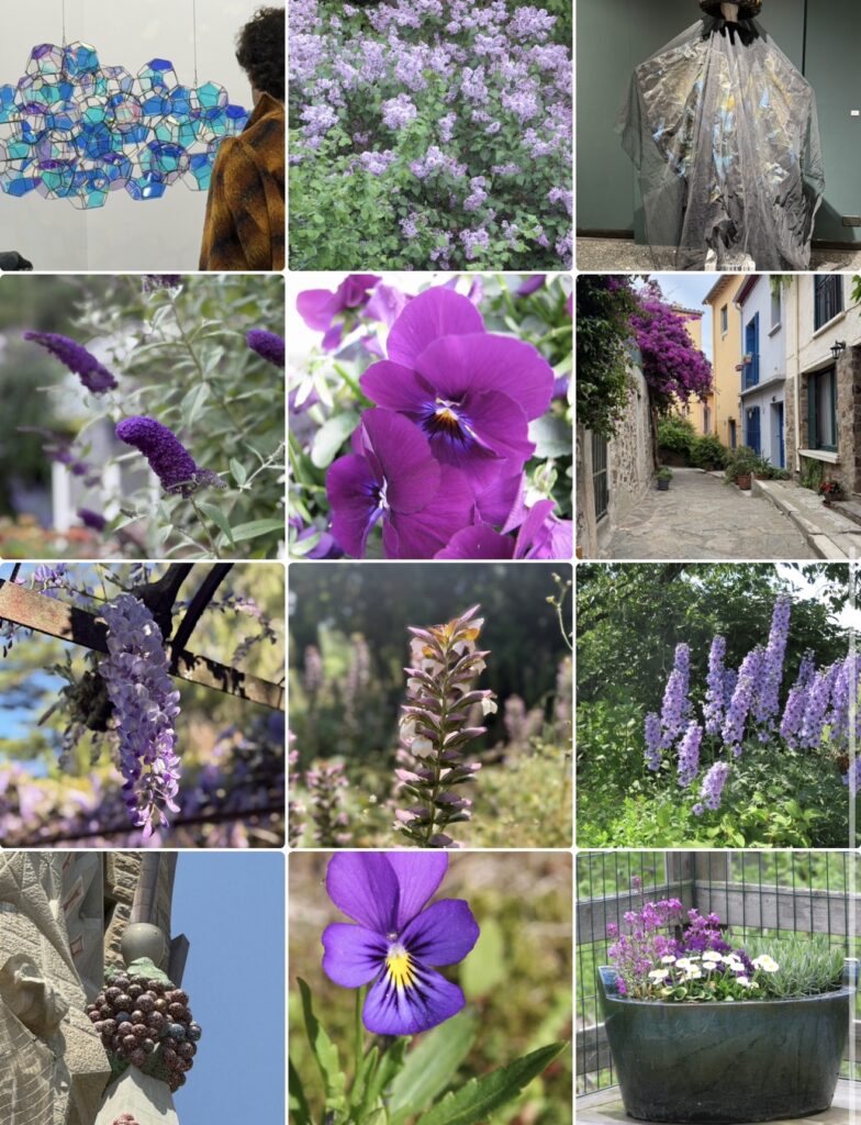
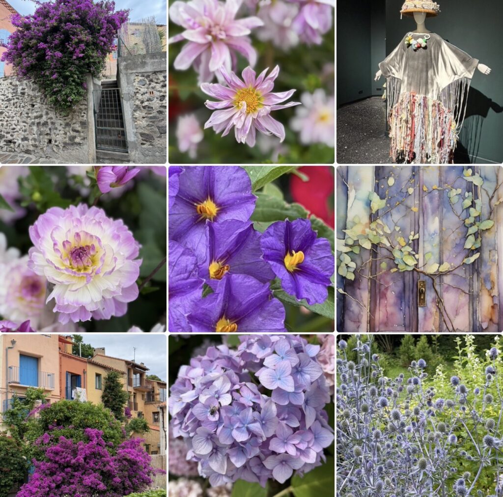
When the photographs are viewed together, a recurring pattern gradually becomes visible. The collection moves continuously between different environments and forms of expression. Flowers appear beside architectural details, while landscapes, artistic objects, and carefully composed structures coexist within the same visual field. The images resist clear categorization because they seem to belong simultaneously to multiple worlds.
What becomes particularly striking is the repeated presence of transformation. Flowers appear at different stages of development, light alters surfaces and textures, and colours shift as they interact with their surroundings. Several of the photographs seem to capture moments that exist only briefly, as though they were documenting transitions rather than destinations.
The collection also reveals a fascinating tension between structure and fluidity. Certain images are defined by strong forms and clearly recognizable patterns, while others dissolve into softer boundaries and more ambiguous compositions. This movement between definition and openness creates a rhythm that encourages the viewer to slow down and spend time exploring the relationships between the images.
Perhaps this is why the collage feels less like a collection of separate photographs and more like a conversation about change itself. The images suggest that meaning often emerges not from fixed categories but from the relationships that develop between them.
The more time spent with the photographs, the more difficult it becomes to identify clear divisions between nature and culture, movement and stillness, certainty and ambiguity. The boundaries remain visible, but they no longer appear absolute.
The value of what lies between
Modern societies have a complicated relationship with ambiguity. Categories provide comfort because they create order and predictability. Definitions simplify communication and make complex experiences easier to understand. Yet many of the most significant moments in human life resist such simplification.
Learning occupies an intermediate space between ignorance and knowledge. Creativity emerges between structure and freedom. Leadership often develops through periods of uncertainty rather than through moments of complete confidence. Personal transformation rarely follows a predictable path and frequently unfolds during transitions in which previous identities no longer feel entirely accurate while new ones have not yet fully emerged.
The photographs suggest that these in-between spaces should not be understood as temporary interruptions. Instead, they may represent some of the most productive and creative periods of human experience.
This perspective feels particularly relevant in an age shaped by technological, social, and environmental change. Artificial intelligence is transforming professions, organizations, and educational systems. Traditional career paths are becoming less linear, while established assumptions about work, creativity, and human identity are being reconsidered. Many people find themselves navigating landscapes in which old frameworks no longer provide sufficient guidance and new frameworks have not yet fully developed.
Under these conditions, ambiguity begins to look less like a problem and more like a necessary condition for adaptation.
The colour violet captures this experience remarkably well. It does not encourage the search for definitive answers. Instead, it suggests that uncertainty can become a space for reflection, experimentation, and discovery.
An invitation
The photographs invite viewers to pay attention to the image that feels most difficult to define. The attraction may seem unexpected because ambiguity rarely draws attention as quickly as certainty. Yet the image that resists immediate interpretation often becomes the one that remains in memory.
The collection ultimately returns to a question that extends far beyond colour itself.
What happens when resistance to uncertainty is replaced by curiosity about what lies between?
Perhaps this is why violet continues to fascinate artists, photographers, and designers. It reminds us that life is rarely divided into clearly defined categories. Many of our most meaningful experiences occur while crossing thresholds, inhabiting transitions, and learning to navigate landscapes that cannot yet be fully described.
Rather than asking us to choose between one possibility and another, violet invites us to remain present within the space that connects them.
About The Colour of Seeing
This essay is part of The Colour of Seeing, a series of photographic reflections exploring how colours shape perception, memory, emotions, and meaning. All photographs taken by Novisali.
Readers interested in the broader ideas behind the series are invited to begin with the introductory Story, which explores insights from colour psychology, design, philosophy, art, and contemporary research into how colours influence the way we experience the world.

Novisali crafts visual conversations that challenge perception and invite deeper reflection on the world we live in.