
The Colour of Seeing: What Colour Reveals About the Way We Experience the World
Why colour matters
Why are we drawn to certain colours at particular moments in time? Why do some colours evoke trust while others awaken memories, create a sense of belonging, or invite reflection? And why, in a world increasingly shaped by artificial intelligence, technological acceleration, and constant change, do softer, more natural colour palettes seem to resonate so strongly?
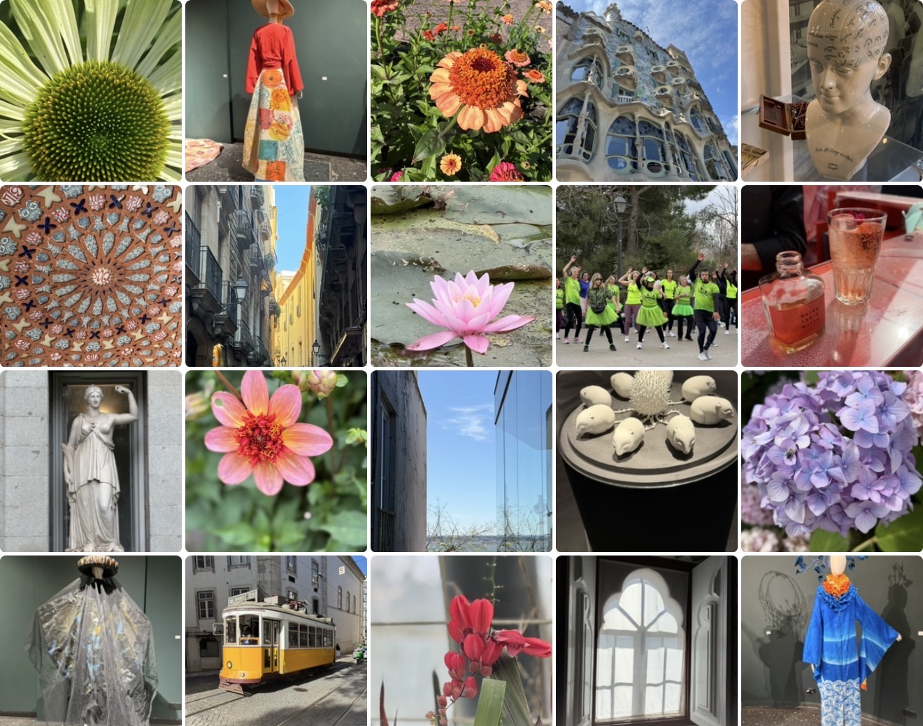
These questions became the starting point for The Colour of Seeing, a series of photographic essays exploring the relationship between colour, perception, and meaning.
What began as a collection of photographs gradually developed into a broader exploration of colour itself. Research in psychology suggests that colours influence attention, memory, emotions, and decision-making. Designers have long understood that colour shapes the way people interact with products, spaces, and technology, while anthropologists have demonstrated that colours function as cultural languages whose meanings evolve through history, traditions, and shared experiences.
This broader perspective suggests that colour is far more than a visual characteristic. It is one of the many ways through which human beings organize experience, communicate values, and create meaning.
Colour as a reflection of the zeitgeist
This understanding is reflected in Pantone’s interpretation of colour as a reflection of the cultural zeitgeist. Rather than approaching colour as a matter of aesthetics alone, Pantone examines how colours capture the emotional atmosphere of a particular moment in history.
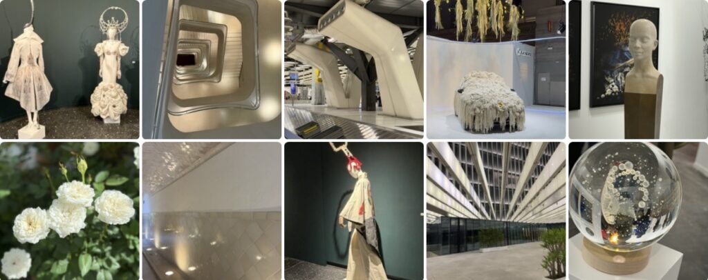
The selection of Cloud Dancer as the Colour of the Year for 2026 offers an interesting example. In a period characterized by rapid technological development, expanding artificial intelligence, geopolitical uncertainty, and environmental challenges, the choice of a soft, natural white suggests a collective desire for restoration, clarity, simplicity, and reconnection.
This observation raises an intriguing possibility. Colours may not simply reflect individual preferences. They may also reveal broader cultural movements and changing social priorities. The colours that resonate most strongly at a particular moment may tell us something about who we are, what we value, and what we feel is missing.
Seen from this perspective, colour becomes a form of cultural observation.
Art, technology, and the act of seeing
Colour, however, cannot be fully understood through psychology, design, or cultural analysis alone. Art introduces another dimension.
A thought-provoking essay published in Aeon proposes that art should not be viewed simply as a product of human development. Instead, artistic expression may have played an essential role in shaping human consciousness itself. Whether one fully accepts this argument or not, it highlights an important insight: art does more than represent reality. It transforms perception.
This idea becomes particularly interesting in an age increasingly influenced by artificial intelligence. Algorithms can identify colours, classify images, and generate visual compositions, yet the human experience of colour extends far beyond recognition and categorization. Colours evoke memories, create emotional responses, and influence the way places, objects, and relationships are experienced.
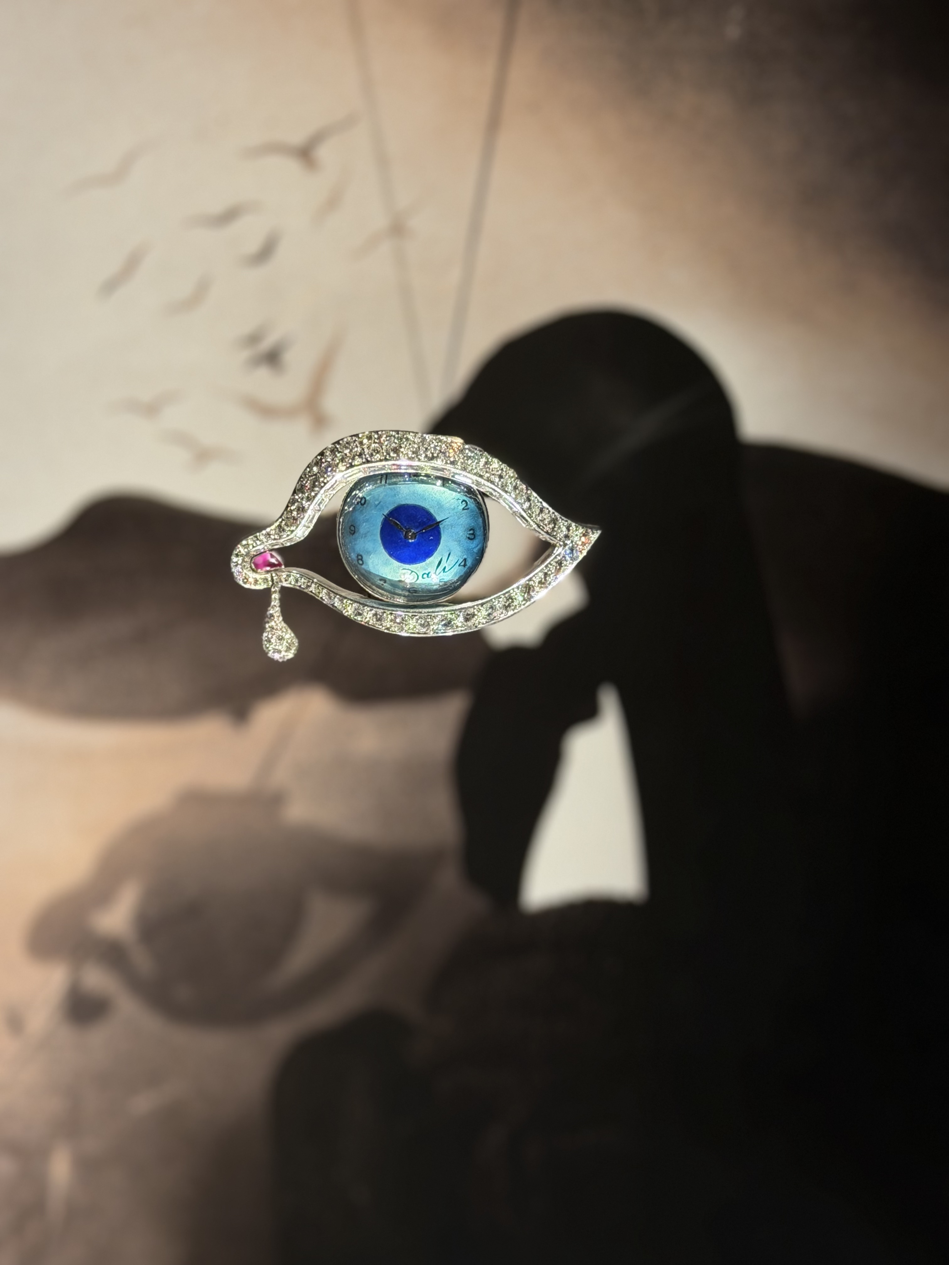
Photography occupies an especially interesting position within this conversation because it exists between observation and interpretation. A photograph records a moment, but it also reshapes it through framing, perspective, light, and selection. The image that emerges is never a simple reproduction of reality. It is also an invitation to see differently.
The Colour of Seeing
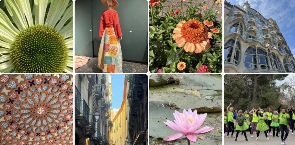
This realization gradually changed the direction of the project. The photographs stopped functioning as individual images and began to form visual constellations connected through colour. Flowers, landscapes, architecture, textures, objects, and details that initially appeared unrelated started to reveal unexpected relationships.
Each colour seemed to open a different conversation.
Blue became a meditation on wonder and the search for the infinite. Green explored growth and the art of becoming. Yellow invited reflection on attention and the practice of noticing, while pink opened a conversation about care and human connection. White became an exploration of stillness and possibility. Warm white shifted the focus toward memory, home, and belonging. Orange reflected on warmth and community, red on presence and visibility, and violet on ambiguity and transformation.The project evolved into a series of visual essays in which colour became both a unifying element and a way of exploring different aspects of human experience.
An invitation to explore
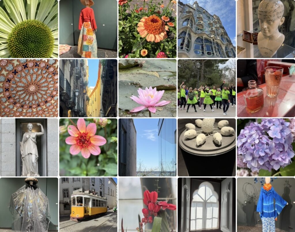
The essays that follow do not attempt to define colours or provide definitive interpretations. Instead, each begins with a photographic collage and unfolds through four perspectives: the colour in the world, the visual patterns that emerge within the collection, the philosophical questions suggested by the images, and an invitation to the reader.
The intention is not to explain colour but to encourage a slower form of observation and reflection.
Perhaps colours influence far more than aesthetic preferences. They shape the environments we create, the memories we preserve, the emotions we experience, and the ways in which we understand the world around us.
Perhaps colours are not simply things we see.
Perhaps they are ways through which we learn to see.
The essays that follow
Each colour opens a different conversation and explores a distinct aspect of human experience. All photographs taken by Novisali.
- Blue — Wonder and the Search for the Infinite: Where do we look for the infinite?
- Yellow — Attention and the Practice of Noticing: Does beauty exist before it is noticed?
- Green — Growth and the Art of Becoming: Is becoming the essence of life?Upcoming;
- Warm White — Memory and Belonging: What transforms a space into a place that feels like home?
- Pink — Care and Human Connection: Can tenderness be a form of strength?
Upcoming
- Orange — Warmth and Community: Is warmth something we receive, or something we create?
- Red — Presence and Visibility: What do we choose to make visible?
- White — Stillness and Possibility: Is emptiness the absence of something, or the beginning of possibility?
- Violet — Ambiguity and Transformation: What happens when we stop resisting what lies between?
References and further reading
The essays in The Colour of Seeing combine insights from colour psychology, design, philosophy, and art with photographic observations from the Novisali archive. The references below provide additional context for readers who would like to explore these ideas further.
Pantone and colour as a reflection of culture
Speaking the Language of Color (Figma/Pantone Color Institute) – An exploration of colour psychology, the cultural zeitgeist, and the thinking behind the selection of Cloud Dancer as the 2026 Colour of the Year. Figma
Art and human consciousness
Humans Did Not Invent Art. It Was the Other Way Around (Aeon) – A philosophical essay proposing that art did not simply emerge from human consciousness but may have contributed to its development. Aeon
Colour, perception, and the act of seeing
What Colour Do You See? (Aeon) – An examination of how individuals experience colour differently and what those differences reveal about perception. Aeon
Seeing Is Not Simple: You Need to Be Both Knowing and Naive (Aeon) – A thoughtful exploration of observation, perception, and the challenge of learning to see differently. Aeon
The intersection of art, perception, and science
The Colour Wheels of Art, Perception, Science and Physiology (Optics & Laser Technology) – An academic article examining how different disciplines understand and organize colour. ScienceDirect
About Novisali

Novisali, (alias Liselotte Engstam), is besides her roles as professional board member and advisor, a multi-media artist, with a curious, explorative mind and an ambition to learn and extend art experiences to current and new audiences using both traditional and new digital mediums. More information and exhibitions can be found via Novisali.com

This blog post was originally shared at www.digoshen.com, and is also shared at the blog of www.liselotteengstam.com, with the artist name Novisali.
Novisali Novisali